
Level5 Website Redesign | 2024
Branding + Strategy, website redesign for design+build firm.
My Role
Lead UX Designer
On the agency side, I worked with the director of UX as well as a project manager, and on the client side I interfaced with the President, CEO, and Head of Marketing.

Previous Home Page
Project Background
Level5 is a full service design+build firm servicing primarily financial institutions (banks & credit unions). Level5 approached my team for a much needed brand re-imagining and a redesign of their existing website to better tell the story of the services they provide, as well as give the team the clean, elevated look that reflects the quality of the work they deliver.
Discovery
To kick the project off, I started by doing a deep dive into the current state website to get a strong understanding of what was and wasn’t working. I created architecture and heuristic documents that helped moving forward.

Competitive / Analogous Analysis

In an effort to gain an understanding of common industry patterns and user expectations, I conducted a competitive analysis that included direct competitors and their treatments of the considered elements. I also brought in non-competitors but full service platforms that were doing things that were structured similarly, to see if I could draw inspiration from outside the businesses’ direct sphere of influence.
Brand, Voice, Vision / Strategy Workshops
We ran a series of in-person workshops with the clients. I wanted to learn three things:
A deep understanding of the customer, including wants, needs, and actions taken during the process.
The process of designing+building, including every activity that the company engages in throughout the months long process.
Are there gaps where opportunities exist along the customer’s buying journey?
Level5 Process Map
We tracked all company activities from pre-engagement, through the phases of their process, to post-engagement, and identified opportunities in those areas.

Level5 Process Map (Zoomed In)

Level5 Process Map (Zoomed Out)
Customer Buying Decision Map
We approached the customer buying journey from a Jobs to Be Done framework, which helped us look at the Why behind decisions, not just the What.

Customer Buying Decision Map (zoomed in)

Customer Buying Decision Map (Zoomed Out)
User Types & Needs
When we first spoke with the client, we discussed which roles inside of the financial institution are looking at their site/making decisions, and we learned that CEOs are the main point of contact for Level5.
What we discovered in our workshops, as we began talking about the CEOs were that there were really two distinct TYPES of CEOs— the older generation and the newer generation. We defined their key differences, including their unique + shared goals, pain points, thoughts/feelings, and in the end, we made some informed assumptions about what content types these two groups would value most.

Differentiators Map
Now that we had a good understanding of both process and user, we worked with the client on defining the things about the company/process differentiates them from their competition— we want to be telling a unique story of how L5 solves client problems. We specifically looked at differentiators across the entire process, to ensure that we have content to pull from in all areas of the site.

Channel Mapping
We ended the workshops by mapping the ways in which L5 currently engages with clients, again from a Jobs to be Done mentality. We identified the channels, the channel’s individual purpose, and where that content lands in the customer buying journey. This exercise allowed the client to see the unique capabilities of a website, and how it interconnects with all aspects of the customer journey, from first thought through to delivery.

Strategy
Brand Strategy & Experience Pillars
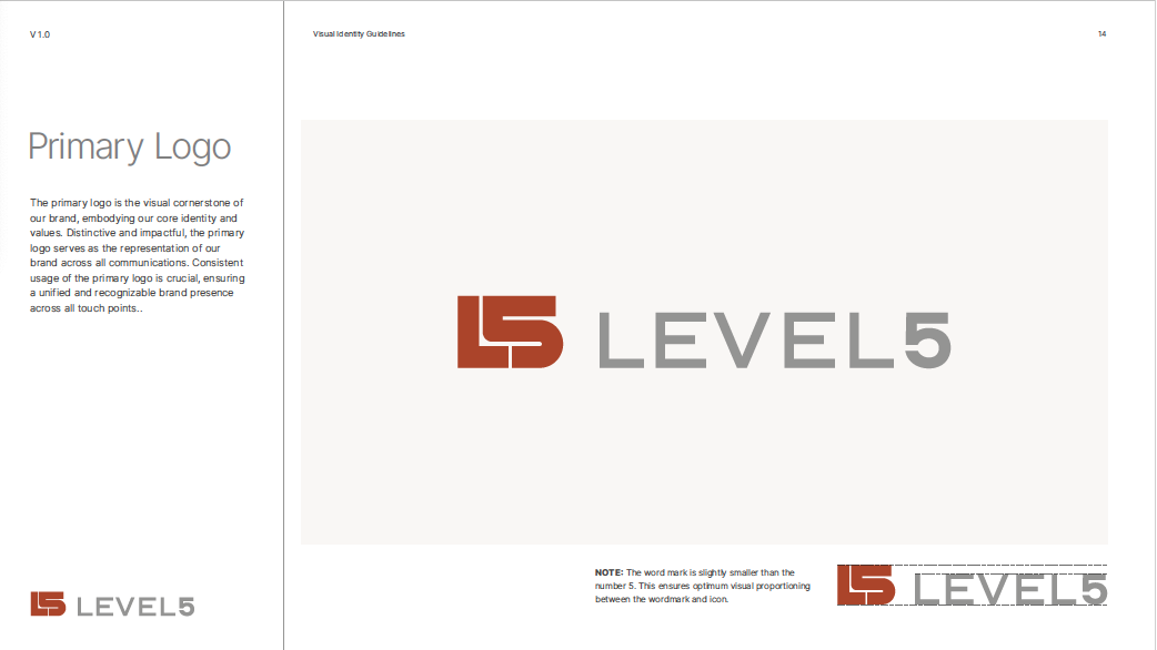
Our team designed a new logo, and wrote a series of brand pillars.

Personas
I advanced the work we’d done on personas during the workshop, eventually defining the two personas into The Caretaker, and The Influencer. Our personas identified our users’ ethnographic information, what matters most, and the types of things they want to see from L5.


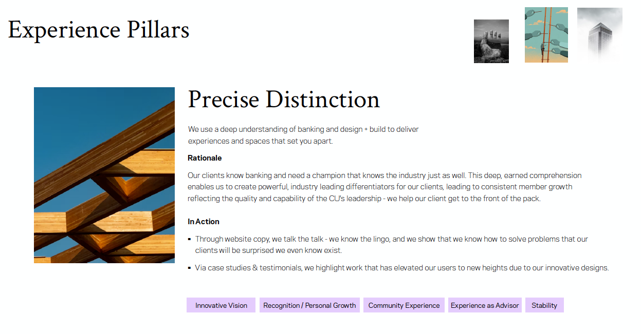
Experience Principles
Because the difference and purpose of brand and experience pillars can be confusing to a client, I built this content map to demonstrate how each piece of what we do ladders up to delivering a complete, intentional experience for their users.

I wanted the experience pillars to be actionable and feel grounded to user needs, so I defined each with a description, a rationale, and what it might look like “In Action”.


Design & Development
We kicked off design, operating in a 2-week sprint cycle. I moved quickly from low fidelity wireframes into high-fidelity, sharing progress and presenting ideas with clients weekly.
Home
The redesign of the home page was all about being a one stop shop, giving the user a strong landing page with a little bit of all of the high level elements.
Who we are, what we do, and why you should trust us with your project.
Before: Cluttered, no clear message, lots of competing elements, main navigation hidden.
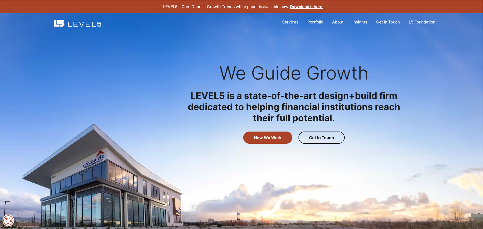
After: Big, bold messaging, defining LEVEL5’s aspirational purpose, with clear navigation and CTA links for key pages.


LEVEL5 (wisely) didn’t want their build photos to be shown without context — they’re not selling architecture design styles, they’re selling a process that determines what works best for each client.
So I added client quotes overlayed on top of the build photos, to keep the focus on impact.
What’s Next Behavior — Throughout the site, I ensured that all pages had clear behavior management patterns, intentional next steps or signposting to increase user engagement and prevent bouncing.


Services

Before: The overall services section was pretty bare-bones, with just a quick blurb about each service.

After: A colored CTA in the right rail where shoppers frequently look draws the eye and gives a description of the specific offer. When the user clicks on the offer, the page will scroll to the relevant section lower on the page.

After: We crafted descriptions of each phase that connected, and that laddered back up to the overarching process. We also added individual pages for each service. So high level —> deep dive.
Individual Service Pages - In the redesign, we added individual pages for each service.
The main navigation page can then operate as an overview, telling the story of the end-to-end process L5 sells, while individual service pages can act as deeper, more focused dives into each step in the process.

Portfolio
We rethought the value of splitting up work samples by region, and focused on telling the story of how L5 solved specific customer needs. We looked at how best to scale this page over time, and we came up with three types of case studies:
Simple — A paired down image gallery that identifies the name of the company and the type of project. This would be the majority of the projects.
Featured — Full case studies (like this one) that tell the end-to-end of a project. Because of the lift to build these, the company would only build them for high-profile projects that will do a good job highlighting the full process.
Focused — Sort of a mini-featured case study, these would tell a paired down story about how L5 were able to really nail a single part of the process for a client (e.g. highlighting a really great tech integration, or site selection). Due to scope, this type would be implemented moving forward, when the right project comes up.
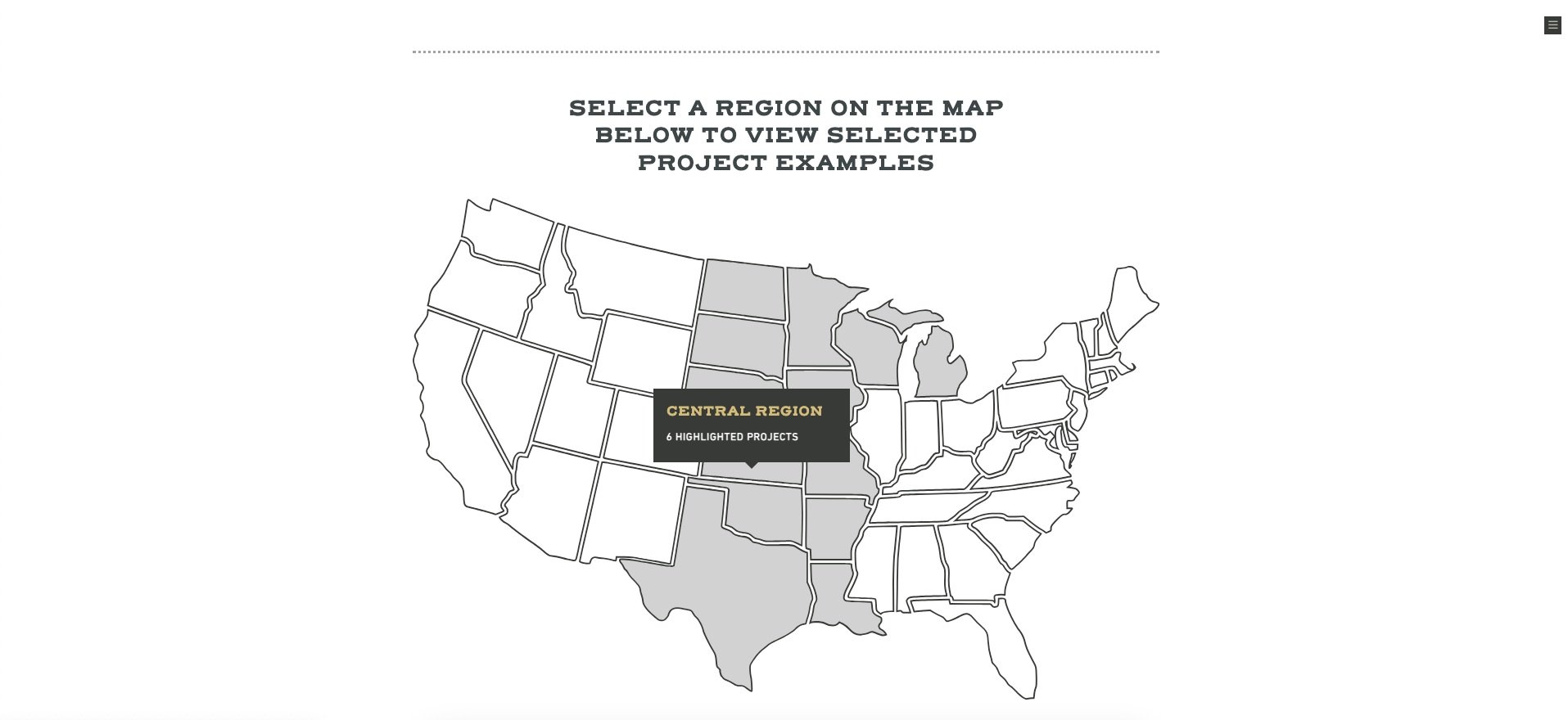

Before: The way a user would find project information is by going through an interactive US map, which filters results by region. Then, without any context of the type of project, if L5 had photos, the user could view them in an overlay. Too many steps and there’s no real reason to force users to filter projects by region, since there’s nothing inherent to the region in the process.

Before: What a user would see when viewing photos of a project.
After: With simplified hierarchy, the user can easily determine the total number of items, their before and after discount prices, as well as which item is primary and which is secondary via chips. When an eligible item is added to the cart, an “Bonus Buy Available” chip will be shown. When clicked, it will take the user to the full cart and display a right shelf.
Case Studies
Case studies was a new feature for the redesign — the older version of the website would occasionally have video interview testimonials. I felt that the quality of the interviews was great, but I was concerned that users wouldn’t be willing to sit through a several minute long corporate video, and would want written alternatives to allow for more intentional engagement.

About
This was another page I wanted to expand on. There were two high level points I wanted to get across on this page:
Company culture — we are an empathetic company with values that match our clients.
Pedigree — our team brings the highest level of capability to every deliverable.

Before: Very high level, technical information, and only a little emphasis on their mission/values.

Before: Black and white, bleak photography.

After: Bright, inviting photography paired with statistics about the team’s experience and values.
Insights
The new insights page is really an amalgamation of two former pages, blog and resource downloads.
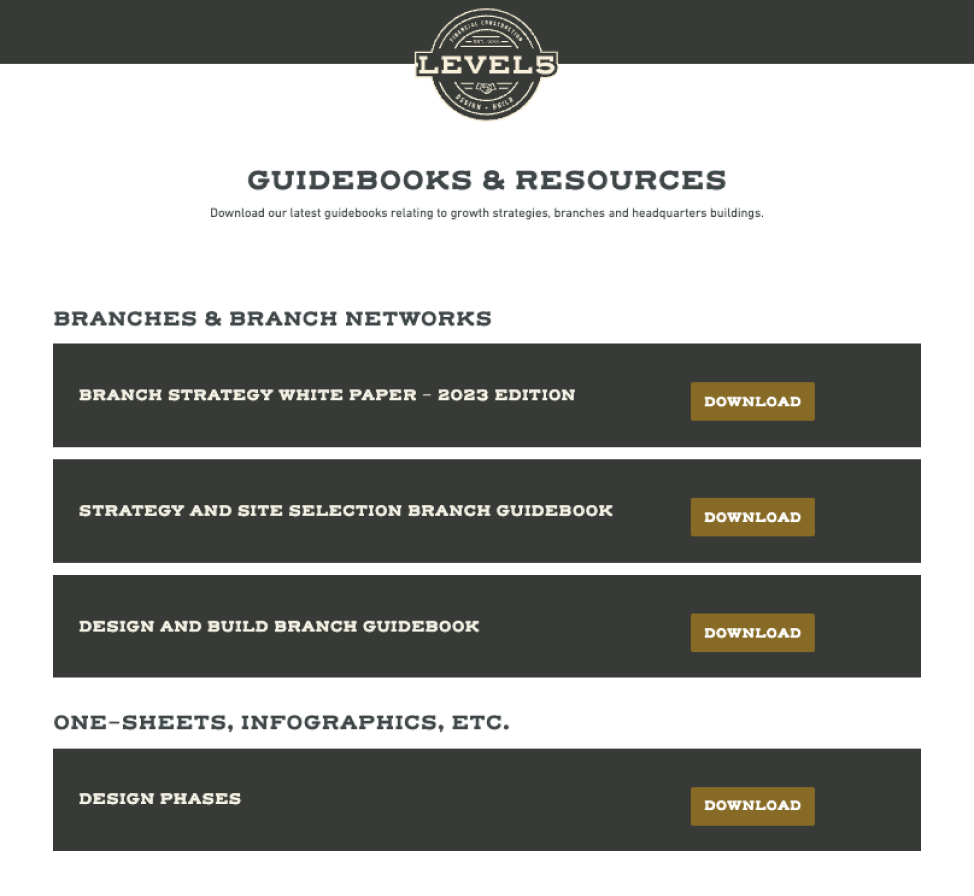
Before: Guidebooks and Resources looked dated, requiring extra steps to get your free download.

Before: Inconsistently formatted blog list, with a lot of category issues.

After: I combined all of the industry articles and downloads together, simplifying the navigation. A featured articles section allows L5 to highlight any article they want, overtop of the catalogue of all available articles.
Insights Categorization - During strategy, I took a deep dive and recommended a more refined list of article categories, based on a clustering exercise with their existing article backlog, as well as an assessment of industry terms.

Article Page
I gave the article page the dot pattern cloud element on the header to differentiate it from other types of content on the site, and to add visual interest.
L5 Foundation
We felt that L5 was missing an opportunity to use their foundation page to better tell stories of success, highlighting the company’s impact on the communities these credit unions operate in, appealing to what CU CEOs value— being member centic. We spent time interviewing the team and came up with a number of great anecdotes that allows me to expand the page.

Before: Single page, very transactional, and the branding was different, making it feel like a completely unrelated thing.

After: Focus on uplifting, community based photography, paired with real statistics of how they’ve impacted communities through their foundation.
Mobile Designs
I just want to add some screens here for other breakpoints.

Portfolio, Home, Insights


Development & Release
I engaged with the development team early and often, checking in with them and ensuring design components would make sense and work in the system we were using, which was Prismic. I am not a developer, but I spent time understanding Prismic’s “Slices” system, so that I could better design towards it. My responsibilities here included:
Componetization & Slices
Ensuring consistency across platforms as designs transition between break points
Internal and Client facing QA & UAT testing
Post Release
Working with our marketing & copywriting collaborators, we built a launch campaign strategy. As part of that process, I designed mockups (including the one in the header of this case study), and animated a series of motion graphics for Linkedin.
I also designed a few other elements.