


PostUp Mobile App - Map Feature Design Sprint | April 2021
The quickest way for remote workers to find a place to work.
TL;DR: As a remote worker, finding a coffee shop or restaurant to hole up in can be difficult - outlets, client meetings, video calls... What if there was one resource remote workers could go to find tailored remote work info about the businesses in their areas?
Role
I functioned as UX/UI Designer. Research was provided by the client. I synthesized insights, designed solutions, tested with users, and iterated on those solutions. The process was run as a modified (solo) GV design sprint.
Intro
I chose this project for my Springboard modified GV design sprint week out of a number of options because this topic really resonated with me. I work remotely, and I also spent some time working professionally as a barista, so I know this subject area from both sides of the coin. For businesses, having workers camp for long hours can affect their bottom line, and for workers, sometimes we just need to get out of the house and work around people (pre-covid) to feel productive. Sometimes you need to meet a client, or just not be in your home office.
Problem
The issue is that not all coffee shops/restaurants are friendly to digital nomads. Some purposely design around having minimal outlets to prevent people staying long. Some require you to spend money every hour for a wifi code. Some just give you dirty looks. With solutions like Google Maps and Google reviews, it can be tedious to find information on the things that are important to nomads, while they’re on the go -- say, between meetings.
The Prompt
PostUp is (in the context of the design prompt) a startup app that currently allows freelancers and remote workers to share tips and advice. The PostUp team has seen user interest in finding good public places to work from. As such, they have already interviewed users and developed personas.
The New Concept
The new “Map” feature that I designed allows users to search, using a map, coffee shops and restaurants near them. The feature provides quick access to ratings provided by users for the things that are most important to nomads: Do they have free wifi? How many outlets are there? Etc. The map also has a quick button for users who need to meet with clients or take a call and don’t have time to search through listings. The app serves up the best possible location nearest them. The goal is to provide nomads with as much information as possible, as quickly as possible.
Target
For this sprint, the startup shared the persona, Nina, with me.

The Freelancer:
Wants to spend less time finding public places to work from, and more time getting her work done.
Wants to find places that have the basic amenities she needs to do her work, before she settles in to start working.
Wants to find somewhere to work that isn’t too crowded or noisy, in case she needs to meet someone, or take a phone call.
While listening to the pre-recorded interview with a target user, I picked up a number of valuable insights:
Good
She found a review that mentioned everything she wanted to know
Most of the necessary information was out there
Bad
Some coffee shops only put up 1 or 2 photos
Sometimes those only focus on pictures of food, so ultimately are useless
Reviews are about food/service, but she needs reviews about amenities
Time consuming to hunt down info
Most apps are based on deciding where to eat/drink, not where to work
Would look at 5-6 real places before deciding
Quotes
“I’d love to see if seats or tables are available.”
“Want to know about amenities… wifi, outlets, bathrooms… There’s not like one great place to find this so I usually have to dig through reviews.”
“It takes a lot of searching and interpretation to find the right place for me.”
The Planning Process
From the content the client provided, I got a really great sense of what features I needed to incorporate to make the experience successful. I focused on:
Providing access to the specific amenities that a freelancer is interested in
Finding a way to ENSURE that users can find a seat wherever they’re going. The issue with a lot of coffee shops is that they’re crowded, and you can’t exactly get reservations for noon at your local bean juice joint.
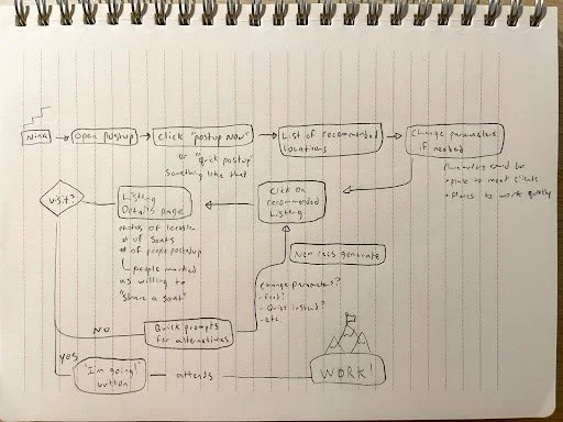
Sprint Day 1
So, I started by sketching out potential user journeys.
It was during this sketching that I first came up with the idea of “Sharing” a seat. Often, coffee shops have entirely full tables, with only one or two people sitting at them, working independently. Sometimes, you’ll see a brave soul walk up and ask to sit with a stranger, but most aren’t social or bold enough for this. The “Share a Seat” option would work like this:
A user goes to their local coffee shop/restaurant and nabs a free table, starts working.
In the PostUp app, they click the “Share a Seat” option, and let others know how many seats they have open at their table.
The app then advertises those available seats to freelancers in the area searching for a place to work.
The freelancer would “claim” the seat, and when they arrive at the coffee shop, the seat sharer would be notified so that the two parties can meetup. No awkwardly walking around the shop trying to find your new work buddy.
This idea solves the problem of constantly traveling to a busy shop, only to find that there’s nowhere to sit. This also cuts down on the burden to the shop, because less freelancers taking up individual tables means more customers can be inside the shop at a time, which means more money. 🤑
Sprint Day 2 - Sketching
Lightning Demos
Google Maps (recommendations specifically)
I chose Google Maps because it’s the most popular map and location recommendation product that exists today. Google has done a great job displaying maps, making travel to and from places simple, and displaying locations and recommendations based on proximity. Google Maps will really be a basis for a lot of the decisions I make with PostUp.
What Google Maps doesn’t do is tailor the experience specifically for the digital nomad experience, which is where something niche like PostUp can build off of the structure honed by Google Maps and serve the needs of a currently unserved user group.


Open Table
I wanted to look at Open Table because it doesn’t default to a map view like Google Maps, so much of the decision making is made on the main screen (left) with a series of cards that mark different time slots, with bits of information about each location. I was interested in this because it could be a good alternative way to display location data if a user is looking to search specifically by “crowded” or “free wifi”.


Airbnb
Airbnb is a bit out of left field for this study, but they offer searching via maps, and one of the focuses is on displaying amenities, which was an important ask from the user interviews for PostUp. Airbnb also displays reviews, and has a quick filter option on the map view.


Crazy 8s Exercise
Day 2 included a crazy 8’s exercise (8 one minute drawings back-to-back) to help quickly generate exciting new ideas. My efforts focused mostly on the map screen, and how I could most efficiently display information so that users are able to focus on exactly what’s important to them.
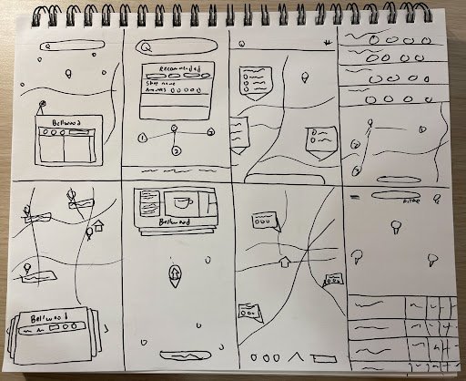

Sketches
The most important thing to me in this design was making sure that the information that was most important to Nina was up front and as quick to access as possible. She can see just by looking at the preview cards if a location suits her needs. If she can’t easily find one that does just by searching, she has quick filters at the bottom that prioritize amenities that are important to digital nomads, or if she’s got an idea in mind, she can search for something at the top. The “I need to…” buttons give quick actions like “I need to… make a call” or “meet a client” and the app will give the closest recommended location that’s been rated highly for that activity. There’s also a feature called “Share a Seat” that users can activate when they’re PostedUp at a location, so that others in the area know that that user is prepared to share a seat or two at the table they’re occupying. This lowers the burden on the business, and builds networks. You could be sitting with your next client!
Sprint Day 3 - Decide
In these storyboards I’ve mapped the flow if Nina were to want to find a table that someone has saved using the “share a seat” feature, where another user can mark on the app that they have a seat available for Nina to use at their table. The app overall is very straight forward, so my original storyboard sketches from Day 2 actually map out the core loop of looking for a place and choosing a place pretty well, so I thought I’d map out this second feature that is a bit more unique and has the potential to help users in an unexpected way.
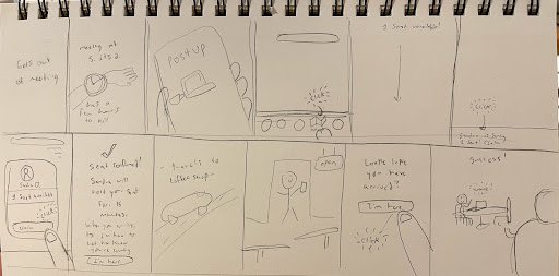
A storyboard of the “Share a Seat” feature
Sprint Day 4 - Prototype
In the prototype, I worked quickly, and focused on mimicking the realistic feeling of being able to scroll through a list of available places. Prototyping a functioning map is difficult in a short period of time, but I knew the more important part of the experience was the cards that display quick snippets of information about the shops, and the quick call to action at the top that allows users to generate a suggestion based on their activity, (e.g. take a call, or meet with a client).

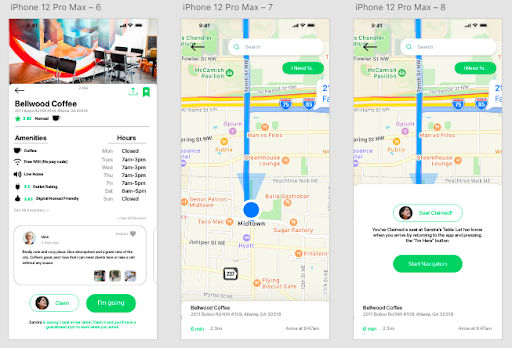
For the purposes of the prototype as a GV sprint, I built a barebones main screen with an obvious CTA to the new feature, since I wasn’t given information about how the rest of the app looks or functions. This way the insight I get from users is specific to this feature.


Sprint Day 5 - User Testing
For the final day of the sprint, my prototype was complete, and I met with five different users that matched as closely as the time allowed to the Nina persona.
I gained a number of important insights from these tests:
Users had trouble noticing the “filters” screen, but when asked how they might better target their search, they did bring up the idea of filters.
Recommendation: I moved the Filter button to the top of the screen, just below the “Search” bar, and next to the “I Need To…” button. This matches the button and card style of the rest of the app, and makes it more obvious.
Since users had a hard time noticing the filters, they didn’t see the “Available Seats” filter, which contained a smiley face icon. This smiley face icon matched icons next to businesses that had available seats on the map. Because users couldn’t find the filters, they didn’t notice the smiley face icons on the map, and therefore didn’t realize there was a visual representation of available seats.
Recommendation: Change the available seats icon to something like a chair, and use a brighter bolder color on the map to draw focus to it, differently than the other listings.
There was some initial confusion about the difference between the “Claim a Seat” and “I’m Going” buttons, but users seemed to understand after reading, how the Claim a Seat button worked. What they didn’t understand was that the “I’m Going” button essentially just connects them to a navigation feature. Users assumed that it communicated to the business they were going to, and essentially reserving a seat. This is a big usability issue, because obviously the business has nothing to do with the app, and aren’t going to be typically willing to allow users to reserve seats.
Recommendation: I’ve since switched the wording on the “I’m Going” button to “Navigate”, to see how users react to that wording instead.
The “I need to… “ button was very popular, users just liked the simplicity and tactile feel of the button, and when asked about different tasks, tended to check the drop down to see if there was an option that suited the task.
Recommendation: I think it might be a good idea to add another option or two to the “I need to” list, to accommodate a larger variety of typical tasks. It will be important to find a balance so that it doesn’t clutter the menu.
One user expressed excitement when needing to meet with a client, that she could quickly get a recommendation for a location, send the location to her client, and then navigate all quickly and efficiently.
Conclusion
This project was exciting, and really resonated with me. I had a number of users ask when this product is releasing so they can use it themselves. If this project were to continue, there are a number of things I’d like to expand on. I think the “Share a Seat” feature has a lot of potential to be expanded on, and users could even favorite and “speed dial” shops they frequent to see if there are available seats.
The exciting challenge with this sprint was “how can I streamline this experience to be the fastest and most efficient version of the typical map/recommendation feature?”
This challenge serves as a reminder that there are a lot of different ways to design the same thing, and it reminds me of the quote by designer Alan Cooper, “If you design for everyone, you delight no one. That leads to mediocre products.”
While Google makes amazing user experiences, challenging myself to basically “Do google maps, but for freelancers” has resulted in something that excites users and is able to find its niche in a market that is well established.