


Tabletalk Mobile App Design | Nov 2020 - April 2021
Changing how tabletop gamers connect - friends first, games second.
TL;DR: Finding people to play tabletop games with can be scary. What if there was an option that lets you get to know someone before you play?
Intro
My girlfriend and I love tabletop games: board games like Catan, card games like Love Letters, and rpgs like Dungeons and Dragons. BUT WE CAN NEVER FIND ANYONE TO PLAY WITH US. We’ve bugged our friends, but they’re not interested. We’re both introverts and are nervous about playing with strangers. Are they going to be weird? What if we start playing a three hour game with people we don’t know, and someone starts going off about why feminism is bad?
Problem
Making friends is hard enough. It can feel scary and overwhelming to try to find people to play with that you get along with. Joining random games online can feel transactional. It’s more about scheduling and filling slots. I don’t want to apply to be in your game if I don’t know if you’re going to be cool or not.
Concept
Tabletalk is a mobile app that helps tabletop gamers find people to play games with, and emphasizes developing friendships based on shared interests, rather than playing with strangers. The goal is to ensure better gaming sessions because groups have a more meaningful connection.
Target
For games to work, someone has to host a game, and someone has to attend the game. When I started the project, I defined these two roles as the GM (game master) and the Player. Later, I revised GM to the Host, after I realized the term caused confusion with users who weren’t familiar with its use.
Research
There are infinite apps/experiences designed to do similar things, like scheduling events and making friends. What dating apps get right is how easy it is to navigate and move through the app. Natural language, simple, intuitive gestural controls, and focused choices helps these experiences stay focused on the core of the experience: finding someone to talk to, and talking to them. With meetup apps, the focus tends to be more on scheduling and attending events, so the emphasis is off of the individual and more on the organization.
Interviews
I conducted four interviews with people I found on popular online forums (mostly Reddit) who frequented the places where people look for people to play with. They were a mix of Player and Host, and I found that Hosts often identified themselves as both, while Players identified pretty solely as players.
During these conversations, I was interested in three main points:
What has their experience been like finding people to play with? Good? Bad? Neutral?
Is there fear or hesitancy in playing with strangers?
How does playing with strangers rather than friends affect the dynamics of a game?

The Host:
Wants to find people to join her game, but is worried about risking the safety or enjoyment of the rest of the group
“It’s really important to me to have a relationship with players outside the game.”

The Player:
Wants to find a game to join, but is worried about meeting strangers, and doesn’t want to have to deal with complicated scheduling.
“I think D&D is best when you think outside the box and don’t take it too seriously.”
While the role of the two personas differs, there were a number of common concerns. Both groups didn’t feel comfortable asking friends to play with them, because it made them feel like a burden. Both groups had had negative experiences in random groups, like prejudices or had felt uncomfortable. One person told a story about how he’d wound up in a game with a literal nazi.
“I said, ‘He can’t be that bad! At least he’s not a nazi!’ And the table got real quiet. I was like OH NO... Turns out he was a lot more sympathetic to the hyperbolic example of a bad guy than I thought he would be...”
What surprised me was that across the board, the priorities of the two groups were that cultural fit like values (lgbt friendly, not being a nazi, etc) were higher priorities, gameplay style (things like what sort of game you like to play, whether you want to focus on story or combat) were medium priorities, and scheduling actually came up as a priority or consideration much less often than I’d anticipated. It seems that people in general are more concerned with getting into uncomfortable or scary situations than making sure a game matches their schedule.
The Planning Process
From talking to users, I got a sense of what sort of features I needed in order to make the experience successful. For the MVP I focused on these three features:
Hosts need to be able to create games so that they can recruit players
Hosts need to be able to manage their listings (editing/deleting/accepting join requests)
Players need to be able to view and join games
I developed an affinity map from the interview findings, and used that to create an empathy map. These both informed the personas. Taking these extra steps made me feel more confident when making decisions about key product features.
Once I felt I had a strong understanding of who my users were and what their challenges are, I began to work on user stories. I had so many different ideas, and wrote them all down. I looked at themes, and then created epics to group features together.

Once I understood the different types of stories, I compared the features with the priorities of my users, and began to determine which features would be included in the MVP and which would be slated for a later V2 release. This allowed me to focus on the features most integral to the experience, so that I could start getting insight on my designs.
Architecture
Once I understood the kinds of things my users wanted to do with the app, I did some rough sketches of how the content might connect. Then I refined those sketches into a site map. This site map helped narrow the scope and highlight the features that were most important.

User Flow
These red routes highlight critical user flows of the app and help to break down the individual steps the user will take in achieving each task. This helped me make sure I was designing a product that is compact and lean, focusing more on getting to the important stuff than on systems and complicated navigation.
Creating a Listing

Managing A Listing

Joining A Listing

The Design Process
I had goals about how I wanted the experience to feel. I knew it needed to have a friendly, conversational tone, and aesthetically I wanted it to feel easy, intuitive, and inviting.
I sketched some rough sketches that served as more specific brainstorming about the ways in which the app will present information to the user.


In general, pen and paper sketching isn’t my favorite way to ideate for apps (I prefer wireframes because of how quickly iteration/experimentation can be done) but the nice thing about sketching is that, because it’s so slow, it requires you to take a moment as you’re drawing individual elements and consider their form, how does it serve the function? Should this box be rounded? Why?
Wireframes/Prototypes
I like to connect the dots as I build, so as I was working on the wireframe, I built out early prototypes, connecting different screens to see how the flow will work. Because of my background in motion design, I think in terms of interactions, of transitions, and state changes are as important a design decision as the shape and style of individual elements.


High Fidelity
I focused the moodboard around the color green, because my gut told me that green would be a good friendly color that feels fun but also clean. I included cute illustrations to match the creative, playful experience that tabletop gaming resonates to me.

For my first stylized attempt, I experimented with a number of different combinations of soft and primary colors to make the app feel fun and welcoming. I experimented with the below red as a bold focus color. I showed these early designs to friends for feedback, and I would say ultimately, none of these early iterations were successful, but they were instrumental in dialing the look for the second iteration.
Design Style 1

For the second iteration, I went back to the moodboard and tried to better emphasize the clean, open feeling of the designs, and dialed back the use of primary colors so that their presence would draw focus more effectively.
Design Style 2


Upon landing on the color scheme above, which felt more balanced, I developed a style guide to lend consistency to the remainder of the screens as I built out the high-fidelity wireframes/prototype. (Illustrations by Varguy on Twitter/Deviantart/Instagram)
Style Guide

The combination of the clean professional Semplicata Pro font for headers and the more rounded, friendly Hero New for body and subheaders gave the app a clean, modern look while still feeling inviting. Users in usability testing commented on the effectiveness of the font combinations.
Usability & Iteration
During this round of feedback, I met with four different users, some who participated in my initial interviews and some who were new to the product.

When tasked with looking for games that other people have created, versus looking for games that the user themselves is a part of, users were inconsistent about where they expected those games to be located, so in the second iteration, I added more helpful clues on the empty state home page, and renamed “Games” to “Home” in the menu bar. I also changed the icon for “Listings” to something more universally recognized, a game controller. In the second round of testing, users were more successful in locating content that they were associated with. Finally, in the first design, users didn’t always locate their profile information, so I swapped the hamburger menu with a profile badge, and when the user clicks on the new profile image, they are taken directly to the profile for editing. Previously, account settings and less important links were included in the hamburger menu, which I relocated to a more iconic settings cog wheel icon on the top of the profile menu.

One of the biggest confusions on the listings page was that it wasn’t clear that the listings contained different types of games, and that there was a mixture of posts from the players as well as the hosts (called GMs at that time). In the second iteration, I updated the listings to provide more information, like the specific game being played, and added some of the quick reference filters at the top so that it is more apparent to users what they can and can’t search for on this screen. Users in follow up usability sessions were more likely to try filtering out the type of user they didn’t want to search for. As mentioned in a previous section, I also switched from the small “GM” and “P” icons on the listings to a more obvious written word, “HOST” and “PLAYER”. There was still in the second iteration some confusion around the highlighted “Board”, “RPG”, and “Card” filters, because people would click one intending to filter to show only that item, instead of removing it from the options listed. In a future iteration, I would change the highlight states to be unhighlighted until a user selects one, then have the listings filter by that selected type, since that seems to be more natural to users.

Users were confused about the difference between GM and Player, as I’ve mentioned that the term GM wasn’t universal enough. In the second design, I updated the terminology to be more generic, so users can either host a game, or look for a host. I also added helpful descriptor text based on user feedback that said there wasn’t enough information for them to make an informed decision. Instead of heading the page with “create listing”, which player associated with being something only a host or GM would do, it now is titled “Create a Post”, which is reminiscent of forums like Reddit where players will create posts looking for GMs. This made players who didn’t intend to host games feel like there was something on this screen that related to them. On subsequent usability sessions, the issue became that users, regardless of whether or not they’re intending to lead a game session, feel drawn to select the “Host a Game” button. In a future iteration, I would either de-emphasize one button over the other, or I would change the flow so that these two tasks take place in different areas of the app, to totally avoid confusion.

This screen surprised me the most. I didn’t expect people to have so many difficulties with what they were expected to input here. For “Give your game a name” users weren’t sure how this was going to be displayed to others. Is this the name of the game we’re playing? Is this the title of the post? In the second design, I made small changes like adding clarifying descriptions above each box, and using example text in the fields to help point users in the right direction. On subsequent usability tests, the confusion was no longer pointed out.
Final Prototype Gifs


Conclusion
This project is still in progress! Though this is a project I created for Springboard’s UX Design course, I’ve received such glowing praise from users in the community about how this app opens up so many possibilities for them, that I just have to keep working on it. Things I’m currently working on:
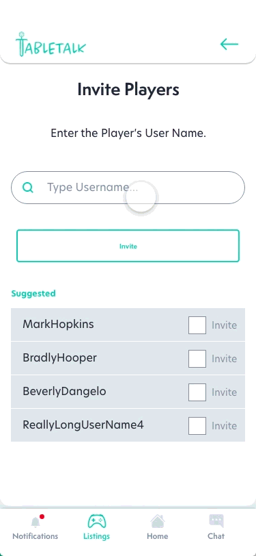
Better flexibility and efficiency of use - users have pointed out different areas that they expect to be able to complete certain actions (e.g. they expect to be able to delete a listing from the listing itself but also from the home screen, they expect to invite a player to a game from the game itself but also from the player’s profile or from a chat window with the player)
Chat functionality - One of the focuses of the app is on friend finding, and I’ve come up with so many exciting ideas for the future. Chatrooms where users can meet people, group chats, game invites by chat/groups, ice breaker AI type conversation/bonding games. I’ve been researching dating apps more here because they do a good job of focusing the experience on starting conversations.