
Rooms to Go Feature Improvements | 2023
Web and Mobile feature improvements for furniture e-commerce site
My Role
Lead UX Designer
On the agency side, I worked with the director of UX as well as an account manager, and on the client side, I interfaced with their head of UX, as well as a Senior UX Designer and a couple junior UX Designers.

Project Background
Rooms to Go is the third largest furniture retailer in the United States. The business is privately owned, and engaged Maxmedia to lead a series of feature improvements.
As part of our work with Rooms to Go, we collaborated to define a series of Big Rocks to ensure that the work we did laddered up to high level company goals.
As part of that work, the below projects were defined as the priorities for the remainder of the year after I joined the team.
Featured Projects
Below you’ll find an overview of some of the projects I designed for Rooms to Go. I would love to chat about the full process for each project with you, so please don’t hesitate to get in touch.
Shortcuts:

Improving user comprehension of available discounts and offer details.
Improving consistency and implementation of impulse accessory purchases.
A ground up figma design system built to be intuitive, actionable, and scalable.
Bonus Buys

To understand this project, there are a couple important terms to understand about Rooms to Go’s business model:
Bonus Buys - A discount a user receives on an item because they are purchasing another item. I have referred to two different types as simple and complex.
Room Sets / Packages - Basically a bundle of items, that can scale. 3pc set might have bed, dresser, and mirror, while 5pc set has bed, dresser, mirror, and two nightstands.
The Design Challenge: Better tell the story of Bonus Buys across the site, ensuring the experience is consistent and clear from the home page, the product page, and all steps of the checkout process.
The previous Bonus Buy experience applied to 24 distinct products across the site, and because Rooms to Go breaks out sizes, materials, colors, etc. into their own product tiles, this number becomes artificially inflated to 56. A total of 57% of these listings are then variant listings.
Research
Benchmarking

As part of discovery, I conducted 15 unmoderated benchmark tests via UserTesting to determine how well the previous Bonus Buy experience performed, and to gather an understanding of user expectations at each stage in the buying process.
I presented to the team general findings, as well as sentiments, word webs to highlight the severity of the issue, and survey results highlighting areas the users expected or preferred to receive information about Bonus Buys.
Below I’ll walk through current state + solutions for the different areas of the site.


““Why use deception and think that once I get to the cart and things aren’t what I expected that I’m gonna keep going and check out?””
Competitive / Analogous Analysis
In an effort to gain an understanding of common industry patterns and user expectations, I conducted a competitive analysis that included direct competitors and their treatments of the considered elements. I also brought in non-competitors but e-commerce platforms that were doing things that were structured similarly, to see if I could draw inspiration from outside the businesses’ direct sphere of influence.
Through this exercise, I learned a few things:

Simple offers are easy to understand.

Clearly marking offers across the site and user buying journey helps with discoverability and reduces surprises.

More complex offers require more explanation and pathing.

More complex offers will also require additional, more complex functionality and development time.
During the strategy phase, I recommended to the client to avoid multi-step offers based on the total number of products impacted across the site, when compared to the degree of complexity that would be required in developing the additional functionality necessary to make the experience clear and not infuriating. Instead, I recommended a redesign of their existing Room Sets system (that complex offers already acted like) so that individual sets could be featured, with special deals for buying up. This would keep both experiences distinct and offers another opportunity to add value to Room Sets, which are a major differentiator for Rooms to Go.
Home

Before: The user couldn’t tell what the current offer was, nor could they be sure what a Bonus Buy actually was.

After: The user is able to get a general idea of what happens in a Bonus Buy, plus specific offers on product tiles.
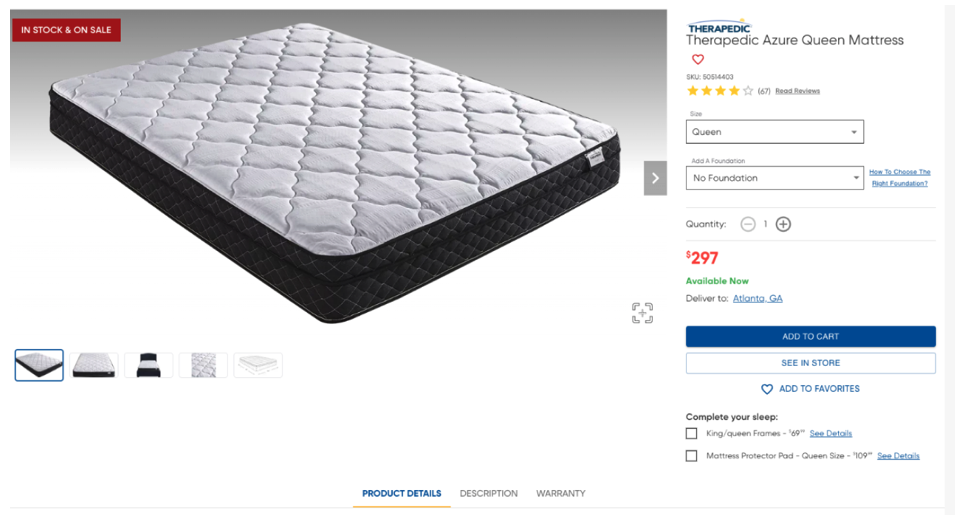
Product Details Page

Before: The only indication of the Bonus Buy offer was the chip on the left side of the product image, where many users missed it. The majority of users expected information to be either further down the page or in the right rail.

After: A colored CTA in the right rail where shoppers frequently look draws the eye and gives a description of the specific offer. When the user clicks on the offer, the page will scroll to the relevant section lower on the page.

Before: The design felt somewhat dated, and the details of the offer confused users. They didn’t understand that they needed to buy the bed set, plus buy an ADDITIONAL nightstand, in order to get a nightstand free.

After: Explainer text helps the user tell where they are, the specific details of the offer, and when adding an offer to the cart, the user sees a list of the specific items they’re adding, the total number of items, and the cost of those items. In general, we also recommended simplifying the offers so that they didn’t require multiple steps (where they act like bundles) because in testing these both confused and angered users.

Also during the mid-sprint, I pitched a version of the experience that utilized a right rail shelf for viewing and selecting offers while remaining on the top of the page.
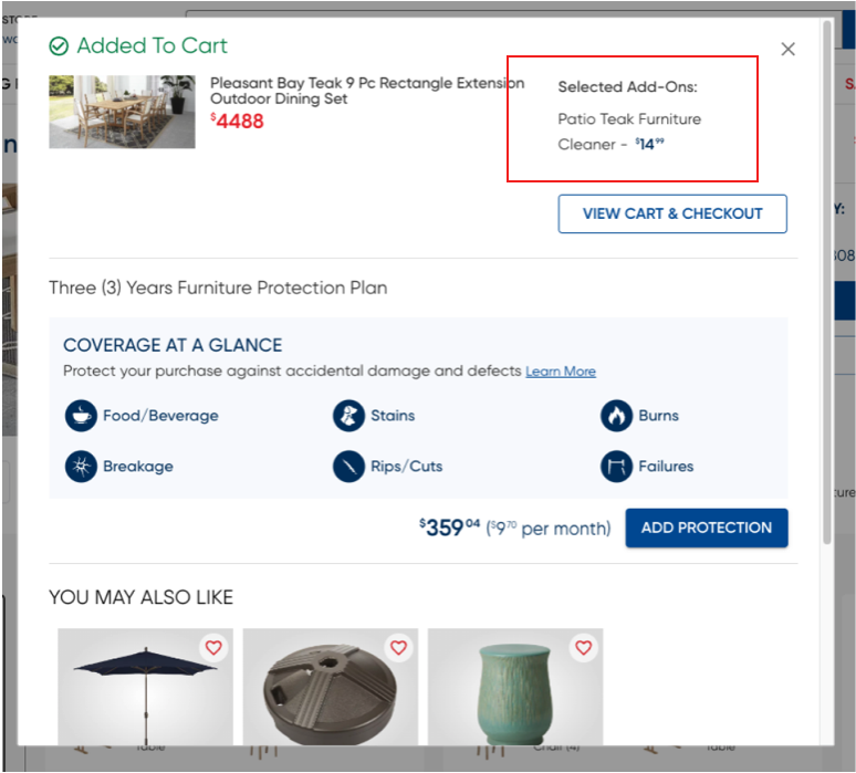
Added to Cart Modal

Before: The user couldn’t easily determine the total number of items added to the cart, the total price of those items, or the relationship between the primary and secondary (discounted) item.

After: With simplified hierarchy, the user can easily determine the total number of items, their before and after discount prices, as well as which item is primary and which is secondary via chips. When an eligible item is added to the cart, an “Bonus Buy Available” chip will be shown. When clicked, it will take the user to the full cart and display a right shelf.
Shopping Cart

Before: During benchmarking, this step usually resulted in the most anger, when the user’s expectation of the situation differed from the final price. Suddenly seeing $600 in their cart unexpectedly caused a lot of drop off.

After: Now that the offer is simplified, the user can see which item is discounted, what the before and after price is, and if there were multiple items, they would be broken out into separate product components. If a user clicks on the links in the Bonus Buy chips, the right rail will open with offer details and eligible items.
Add-Ons

Add-Ons are typically small, paired accessory purchases related to a primary item, and Rooms to Go felt the experience was either inconsistent or entirely not represented across the buying journey.
The challenge was to create a clear and consistent way for users to purchase and view Add-Ons, across:
the PDP
Added to Cart Modal
Cart page
and a new hover state Cart slide-out
And after I reviewed the current state functionality of the website, I added an additional bullet point: Mattresses. Based on the way they were selling mattresses, and the functionality required, I concluded that we would need to account for the mattress design pattern in our solution.
Current State
The concept of Add-Ons currently appeared inconsistently across the site in a number of places.

A “typical” add-on appeared below the Add to Cart button

Or as part of an upsell for # and type of items in a furniture set.

But also below the product details as a “Complete Your Room” upsell.
And finally mattress upsells for foundations, frames, and mattress pads.

Nested Instead of Individual
The other big problem I saw was that the add-on products, regardless of price or significance, were nested under the parent product throughout the checkout process, making it often unclear that additional items were added—giving users an inconsistent understanding of pricing.
Nesting on the Added to Cart Modal

Nesting on the cart page itself
Competitive Analysis Findings
During competitive analysis, I came to a few primary conclusions:
Retailers typically upsell the heaviest on Added to Cart modals.
Users have just made a decision to commit to a purchase, and are most likely to want to add to their cart again at this point, so directing behavior in the added to cart modal is important. Do we want to send them to checkout to capture the sale, or to a relevant PDP to capture additional purchases?


The slideout cart’s intention is much more focused on easy readability.
The intention of the modal state slideout vs. the cart slideout should be clear and distinct. (Some retailers do also include You May Also Like type opportunities in the slideout cart.)
On PDP, Items that are necessary or part of the whole of an item are included in the right rail.


Complimentary/Secondary items not directly related to the item are included in content blocks below the product description.
Final Design Recommendations
Below I break down solutions I designed across the buying journey.
PDP - I grouped the “maintenance” items in the right rail, under “Protect Your Purchase”, along with the existing furniture protection plan. This way it stays above the Add to Cart button.
When a user clicks on the Furniture Cleaner, the right rail slides out to show product details — This keeps the user on the relevant page, rather than encouraging them to jump to another product page, potentially reducing the chance of the user completing the sale.
Finally, when a user adds the Add-On, the Add to Cart button updates to reflect the total number of items being added to the cart, reducing confusion.


In the Complete Your Room example, the user opts in to any additional item, the total number of items is tallied in the Add to Cart button, and if the user selected a maintenance Add On in the right rail, it will be reflected here, so everything will be reflected when adding to the cart.

On mobile, the design is condensed, but the total number is still tallied in the Add to Cart button.

Without the maintenance Add-On

With the maintenance Add-On
Mattress - In the current state, each mattress size had its own PDP, and bed frames/mattress pads were in tiny text below the Add to Cart button. My design simplified all mattress sizes to a drop down, and grouped all of the various Add Ons as part of the end-to-end experience of purchasing a mattress. The foundation, bed frame, and mattress pad wouldn’t be required choices, but having them on the right rail ensures the user takes the time to consider them as part of the buying decision.
I also built a low-profile Guide for each item as a slide out when users click on Guides. Previously, these guides were unwieldy manufacturer PDFs. The slide out allows the user to add a piece to the bundle without leaving the primary item’s PDP, and still gives them the information they need to make a decision.


Added to Cart Modal - Since the Added to Cart slide-out modal was a new (not yet implemented) feature to Rooms to Go, there was still a lack of clarity on the client side about what the intended, distinct use of the feature would be. Because of this, I designed three options, with three distinct focuses, to help narrow our direction.
Option A - Split focus between complete your room and add-ons. I felt this option was a little dense/busy. But sometimes it’s important to see these things to make that determination.
Option B - This option has a larger emphasis on what was added to the cart, with a mixed catalogue of complete your room and add-ons. The presentation here is cleaner and easier to quickly scan.
Option C - This one is a more intimate called shot on one main complete your room item, complete with customer reviews. Plus, below that, we can add on extras+essentials, so this one is kind of the best of both worlds (in my opinion).
*All of these options de-emphasize the need for the full page cart, prioritizing moving users to the checkout or onto another PDP to continue shopping.


A version of Option C in context.
Full Page Cart - I felt that a collapsable CTA for Add Ons would be a great way to emphasize the last chance purchase opportunity. Once the item is added to cart, it transitions to a cart tile.

Add On CTA

Add On has been added, acts as a cart tile now.
Slide Out Cart (Hover State) - The intention for the hover state version of the Cart is to effectively reproduce (e.g. make redundant) the full page cart, making it easier for users to move straight to check out. As a design exercise, it is effectively building a mobile cart design on desktop, which then translates easily to mobile.

Left: Offer 1 Expanded, Offer 2 Collapsed | Middle: Both Offers Expanded | Right: Offer 1 Added, Offer 2 Collapsed

A version of the hover state cart in context.
Dwell Design System

Overview
To help the internal Rooms to Go team design actionably, quickly, and easily, I designed and built a design system framework from the ground up. To help the team learn the system and be able to build out additional components in the future, I ran the team through a crash course on Figma design system fundamentals such as tokenization, components, styles and variables.
Before: In the previous version of the Rooms to Go design system, the team was spread across several different design files, which, with a small team, made management and maintenance difficult. The team used a stock MUI library for components, but over time had built a separate file for mobile, custom or reusable web components, and another for just icons. The general sentiment was that their published libraries were cluttered and it was hard to find what they needed.
A couple considerations emerged as I began the project:
Due to the age of the existing system, it would be important to add new Figma functionality such as color, text, and spacing variables, and a tokenization system that would allow flexible updating of aspects of design — color and spacing.
I also believed there was an opportunity to add some quality of life improvements that would help the team operate more efficiently, like page/platform mockups, common page templates, and a way to document examples of templates used in real life, or IRLs as I ended up calling them.
Design Approach - I’ve contributed to multiple design systems in my career, but setting up a design system for a client is an entirely different design challenge - I knew I couldn’t just design an entire system, drop it in their laps, and disappear. I also didn’t have an infinite amount of time to complete this project. In order to ensure success, I decided I would layout system foundations and a scaling plan, and use my remaining time to educate the client’s design team on how to build the system over time. The truth is that design systems can’t be built in a day — they’re a living, breathing document—one that must be cared for regularly.
“The truth is that design systems can’t be built in a day — they’re a living, breathing document—one that must be cared for regularly.”
Competitive Analysis & Research - I started the project with two objectives:
A deep dive into as many major design systems’ community files as I could find online (timeboxed, of course)
A crash course on new functionality inside of Figma — Figma’s variable system had just been released, and I wanted to ensure I had a solid grasp on its capabilities so that I could integrate them effectively, and account for future releases in the scaling plan.


Below is the presentation I gave on competitive findings, making sure to contextualize to my client’s needs.


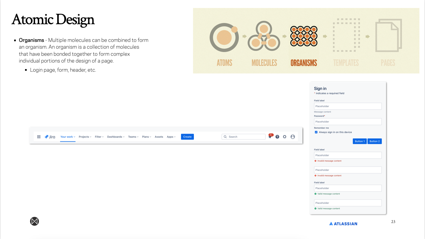
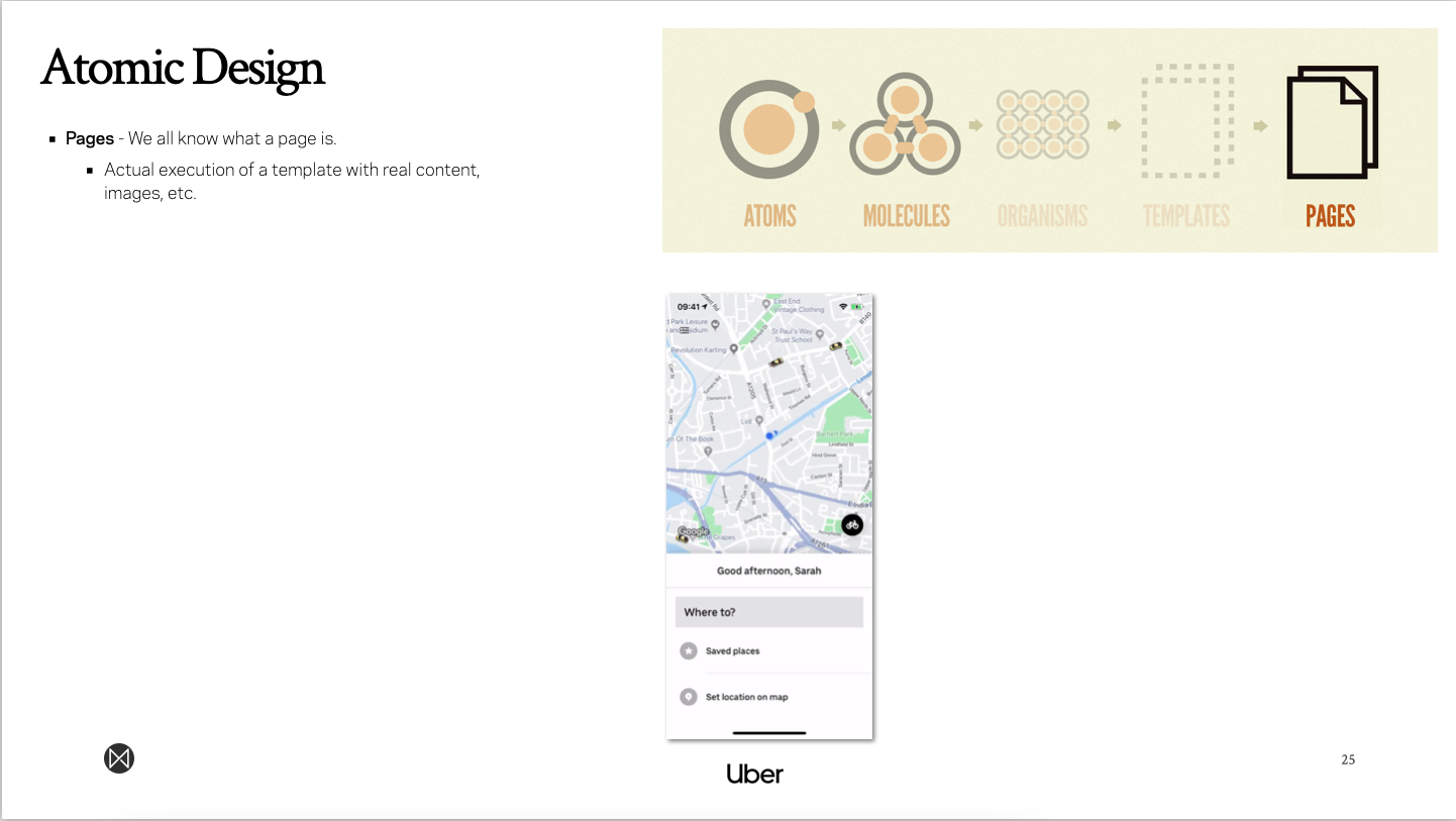
I then walked the client through the principles of Atomic Design, as I felt this was an integral foundation to their understanding of everything that needs to be done to scale a system.
Because Atomic Design as a framework is somewhat dated, I updated it by adding a new element, “Subatomic Particles”, to reflect the systems that need to be setup in order to get to the baseline Atom.
I pulled snippets from different design systems to highlight how the different parts of the system are being used, so that my client could better understand how they might use it.


Branding - To kick off the redesign, I developed a brand identity for the new design system. This serves to give the client a presence to rally efforts behind as they continue to scale.

In my presentation, I broke the design system into two parts to make the content more digestible:
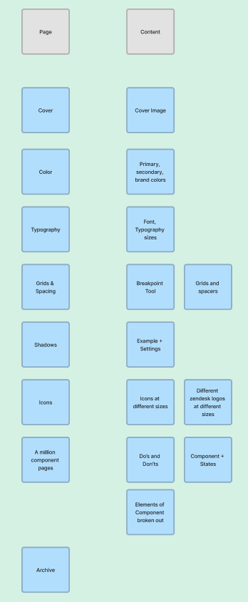
File Structure
Component Principles
File Structure:

I built a design system prioritization to highlight the key areas to get things off the ground, and what can wait.
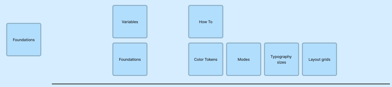
I outlined a Figma page layout plan with core sections, pages, and content needed.


A screengrab of the actual page structure on the design system file.
Semantic Versioning
I outlined the importance of version control through a walkthrough of semantic versioning, how to plan, implement, and follow through on design system updates through versioning.

Component Principles
I laid out the foundations of variables, styling, tokenization, semantics, and variants.


I then built a diagram to outline how new components should be built.

Scaling Plan
I recommended a 1.0 and 2.0 phased approach for the build out, starting with foundations, then building up the atomic design system, until the team is ready to begin storybook integration with developed components and an organized style guide.


Examples from Figma:
Below are some snippets from the file I setup for the client in figma, showing how I built foundations and walkthroughs for how to personalize the framework for RTGs specific growth plan.


